Redesign Volkshochschulen Berlin
With the pandemic, many of our activities have had to shift to digital out of prudence or even relocate due to a lack of alternatives. Systemically relevant industries, whose services and products are intended to keep our country running even in times of crisis, are particularly critical for us as users.
This course focused on analyzing systemically relevant digital offerings. Topics included the evaluation of interface quality, the analysis of existing interfaces and concrete suggestions for improvement. A component library created in Figma served as the basis for the development of an interactive prototype.

Project duration: 3.5 months - 2021/2022
Type of project: University project within one semester
Focus: UI design, system-relevant services
Tools: Figma
Methods: Journey mapping, sketching, wireframes, screen flows, visual design, interaction design
Problem
What does the current VHS Berlin website look like?
I chose the Volkshochschulen Berlin as the topic for the course to redesign a system-relevant service.
The Volkshochschule Berlin stands for affordable continuing education programs in Berlin and the surrounding area. From young adults to old-age pensioners, from yoga classes to photography, all age and target groups are covered. On the VHS website, citizens can browse through a wide range of courses, make a note of courses and, of course, book them.
On the following view pages, various problems for users of the website can be seen:
-
The start page overwhelms the user with various selection options and topics.
-
The course search is overloaded with various input masks. The user is not guided, but rather presented with a multitude of options.
-
The list of results is not user-friendly. The large amount of information makes it difficult to read the content of the respective courses. Important information is not directly visible at a glance.
-
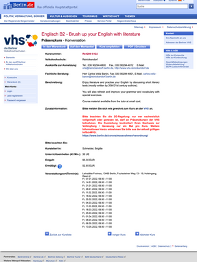
The detailed view of the respective course is also not user-friendly. Without a helpful hierarchy, users have to search for the content themselves.

User flow from the start page to the completion of the course booking
Research
Focus areas
Due to the ever-increasing range of information available on the Internet and the large number of free further education opportunities, the content of the VHS should be easily accessible. With the help of an understandable user guidance, the user should be taken by the hand and not be confused by the mass of information.
Based on a heuristic evaluation of the pages, I focused on the following areas for the redesign:
Usability Problem:
Missing user guidance
The cluttered and untidy interface means that users are overwhelmed with information. They are not guided and do not immediately know what the next step is due to the abundance of information.

Opportunity area 1:
Clear user guidance
The new interface is designed to take users by the hand and guide them without them having to think about it. Users know where they are at all times and what is expected of them.

Usability Problem:
Different design for same content
The interface has many different elements that often have the same function. Elements such as buttons can be found in different versions, the whole design does not seem well thought out.

Opportunity area 2:
Consistent design (system)
The new interface features a revised design system. Buttons differ only in size, not in shape, color or font. Identical elements look the same, and the entire design concept should contain fewer colors.


Excerpt from the Figma Design System
Usability Problem:
Rapid error-proneness without assistance
Due to the large amount of information and the lack of user guidance, problems can quickly arise from which users cannot deduce exactly where the problem lies or how they can help themselves and find a solution.

Opportunity area 3:
Error prevention and troubleshooting
The new interface is designed to protect users from errors as much as possible. In case of an error, users know how to help themselves and can solve the problem with fewer interactions or help/hints.

Excerpt Figma style guide
The final prototype was created in Figma. A specially created design system in Figma formed the basis for the creation of the prototype.


Final designs
Home page


Course search


Result list


Detailed view


Solution design


